9/5/13
8/20/13
Living Room Part 2
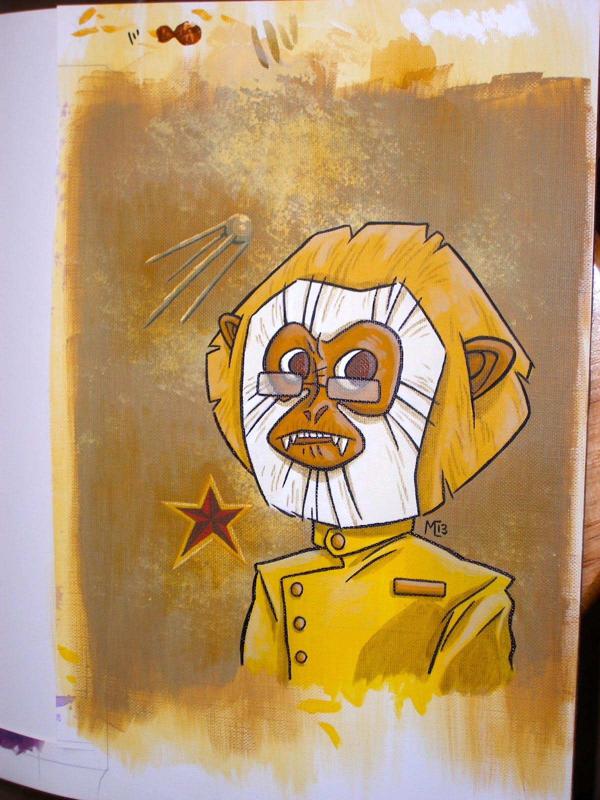
Here is the 'Yellow' monkey. She looks pretty serious. I've been having a great time getting back into the painting. I especially enjoyed the confused reaction to the previous painting in the series from my Father in law. I guess he would never put a smoking purple monkey up in his living room... his loss.

8/11/13
Living Room Part1
My Wife requested that I do a series of paintings for the living room decor. Her only rules were that I follow some of the colour schemes that she has planned (Green, Purple, Yellow). When I started suggesting what I was planning she immediately gave me whole new rule sets like 'No Nudity' and 'No Intravenous Drugs!' and 'No Cross Species Breeding!'. In other words this is going to be some really boring stuff. Anyways, here is my 'Purple' painting. All of them (6 pieces total) will all tell a bit of a story when viewed together.
Of course it has to be monkeys.

Of course it has to be monkeys.

12/25/12
Punk Rock Festivus

12/8/12
Francis the Baby Naming Robot
Let me explain... Isabella was going to a Baby Shower and she asked me what was going to happen at the party. Seeing that my wife was out of the room I took the opportunity to regale her with the 'fact' that the star of a Baby Shower is often a 'baby naming' robot that gets to select the name of the baby. I went on to describe the local baby naming robot is named Francis, and due to some glitch in his programming he names all babies 'Francis'. This, of course, explains why there are so many people in our town named Francis... both boys and girls. This story was quickly recognized by Isabella as goofy fiction, but we both continued to run with it for a few weeks.
At one point I returned from a business trip to find that Isabella had crafted a 3 foot tall cardboard Francis robot for me. He now resides in the studio.
 After Isabella made this awesome robot for me I decided I would have to paint Francis as well.
 Pimp strutting with a cane while blowing binary smoke rings is pretty bad-ass but Isabella made an actual cardboard robot so she wins this round in my opinion.
At one point I returned from a business trip to find that Isabella had crafted a 3 foot tall cardboard Francis robot for me. He now resides in the studio.


12/4/12
Development Painting

This piece was a development painting I did for the project that I'm currently working on. We went in a very different direction in terms of the art style, but I really liked how this turned out. I was going for a 'children's book' look, a water colour washed feel that recalled older Saturday morning cartoons (like 'Fables of the Green Forest' Opening Intro ).
Something classic and timeless that doesn't really push at any new boundaries, nor does it really run the risk of offending anyone's sensibilities. Maybe a little boring, and that's probably one of the reasons the client ultimately passed on this approach. I liked it, and it's different than the other stuff I've been posting so I just wanted to toss it up here to break the monotony of my regular stuff. This piece is digital paint in Photoshop and I tried to really make it look warm and sunny like 11am on a hot Saturday morning in a really fun tree house... I may have overcooked the sunlight FX, as it looks like it could be Chernobyl outside.
11/1/12
Spot

I tried to make the painting of my daughter's second favorite stuffed animal less creepy, and I think I succeeded. This is 'Spot', and Bella specifically requested he be in a pink suit and about 2/3rds of the way through the painting she suggested the hat with a feather in it as well. She was very happy with the final result, and I was happy with that. The photo is a little blurry but you get the general idea. Like the previous Kitty painting, this canvas is 8X10".
Subscribe to:
Posts (Atom)